INTRODUCTION
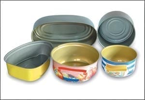
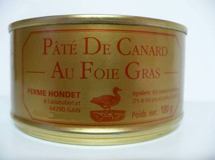
Metal containers in general are often lithographed on the outside and varnished inside. The lithography of the body of the container – and sometimes also the lid – incorporates all the commercial and legal information that the product requires. Its design is very important and the big companies take care of it with great interest given the prestige of its brand image.
The advertising companies study their sketch and the photo-lithium studies capture it in its final size, giving rise to the stain and range of colors. The design of this stain is different depending on the type of container and its manufacturing process. For your study we will differentiate the following groups:
– Bodies of packaging type three pieces with welded side seam.
– Inlaid containers
– Tapas
Within each of them, in turn, the external lithography and the interior varnish must be studied separately.
The lithography is protected by a finishing varnish, therefore externally these two operations must be considered in a differentiated way. The printing techniques are very exact in terms of the positioning of the stain, on the contrary, the varnishing systems are less precise. This means that the tolerable tolerances in dimensioning are broader in the second case than in the first.
BODY OF CONTAINERS THREE PIECES
The development of these bodies is a rectangle, whose base coincides with the same plus the loss of overlap for the weld and its height with that of the body plus the material necessary for the closure.
- A) For the sizing of the lithographic stain we must take into account:
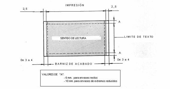
– 1st Parallel to the height it is necessary to leave an unprinted area on both edges that allows overlapping for the union – lost – and perform welding without difficulties. Pollution of this area with inks or varnish alters the passage of electric current causing sparks and weld failures. A suitable value is 2.5 mm per part. See figure 1
Figure 1
– 2nd. On the printing goes the finishing varnish that has to keep free at least the same surfaces indicated in the 1st point. As we have already indicated, since its application is less exact, it is advisable that the varnish reserves be slightly larger to ensure that the aforementioned areas are not invaded. They can be defined between 3 to 4 mm per side. See figure 1
– 3rd. The upper and lower areas of the rectangle, which will be part of the closure of the body with the top and bottom, although they may be covered with ink or varnish – since their influence on the closure is negligible -, they should not contain texts as they could disappear within the same. An adequate value of text exemption is 6 mm. See figure 1. In the case of notched containers – with diameter reduction at the ends – it must be increased to at least 10 mm to also save this area.
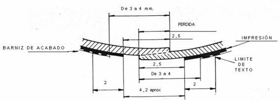
Figure 2 shows a cross section of the seam where the values of the aforementioned conditioners are indicated.
Figure 2
For the dimensioning of the interior varnish stain, the same criteria as indicated in point 2 above must be taken into account.
For the design of the lithography in terms of the distribution of content there are two cases:
- a) Cylindrical packaging: It can be considered as a single whole and distribute the images and texts to the taste of the designer.
- b) Rectangular base package: The contents have to be distributed in four differentiated faces, avoiding texts and illustrations in the corners since they can present deformations due to stretching of the material. In addition, welding of the side seam will be located in one of them. In the case of oval shaped containers, the same criteria can be followed or at least the design can be positioned on two sides coinciding with the areas of least curvature.
SAUSED PACKAGING
For the distribution of the lithography, it must be taken into account that in this case the material suffers a significant stretch, so that the shape of the figures and texts are deformed on the finished packaging quite in relation to the flat printing. This deformation is minimal on the bottom of the container, accentuating on the wall thereof progressively, reaching a maximum in the vicinity of the flange.
Therefore, it is necessary to design the decoration initially deformed, so that after the embossing it has the desired appearance. This alteration depends on many factors, such as: the shape and dimensions of the container, the type of die used, the characteristics of the material, the lubrication used …. To carry out a good lithography design in these cases, a previous study of this deformation is required, and in this way, it can be corrected in the printout. A procedure for this is to use gauges, which consist of printing on a material identical to the one to be used in normal manufacturing, a series of concentric circles, separated one from the other a constant measure – for example one millimeter – up to a diameter maximum that roughly coincides with that of die cutting. Then, samples are stamped in the standard manufacturing conditions: same die and lubrication. The evolution of the deformations along the height of the container is checked. Evaluated the same, the design of the decoration is made deforming it in the same proportion, but in the opposite direction so that in the end the results are the desired ones. These gauges – or samples – should also be varnished to ensure that the results are comparable.
The results are never optimal since the deformations are usually quite random. For this reason, in addition to the previous precautions, when designing the lithography of an embossed container, the following rules must be taken into account:
1º- It must be a very simple design, the less content, the better
2º- It will concentrate as much as possible on the bottom of the container, where the deformation is minimal. At least the important texts should go in this area
3º- No text should be placed in the last third of the height of the container, the area closest to the tab, since it is the one that suffers the most deformation.
4th – The illustration must be reduced to curved and irregular shapes. Straight lines and regular geometric figures will appear deformed.
There are other more complex procedures using sophisticated and expensive equipment to study the deformations but the previous one gives acceptable results.
In the case of embedded packaging, no zone is required to be reserved, therefore the interior and exterior varnishes can be full. The same applies to the coating varnishes, finishing varnishes or inks applied in bulk.
In the case of high load targets it is sometimes convenient to reserve the cutting area, since they generate “fringes” or “threads” of varnish in the filling operation that contaminate the container.
Ends
The impression must be positioned on the cover panel, it is not prudent to invade the vertical wall of the tray, since a minimum decentering of the cover cutout would make the appearance of the cover look even worse. A practical rule would be to take as a reference value of the printing limit, the diameter of the center of the die punch of the lid. As for the text limit, it should still be smaller, approximately said diameter of the center of the punch minus twice the radius of the cuvette, rounded by default.
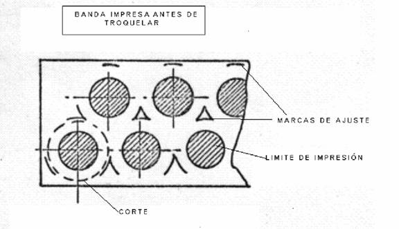
To facilitate the centering of the lithography in the operation of punching the lid, it is used to print a circumference with dashed lines – adjustment marks – with a diameter equal to the cut plus 1.5 mm approx. (This value is a function of the cut between lid and lid). In this way it can be seen with the naked eye – on the skeleton of the already die-cut strip – whether the cut is concentric or not with the impression. See figure 3
Figure 3





0 Comments