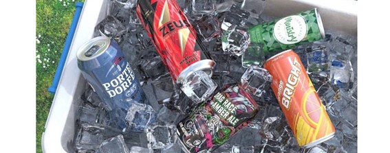
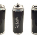
The design and decoration of beverage cans may seem, at first glance, a simple matter, but to capture the attention of the end consumer requires a thorough preliminary work, much more than choosing a particular shape and striking colors that impact. For brands, colorimetry is becoming increasingly important. In addition to brand image, design helps distinguish a craft beer from an energy drink, and that’s when the subconscious comes into play.
For designers, the cans are the perfect canvas to give free rein to their creativity, with more and more daring designs. The metal substrate offers an almost infinite number of shape and size options. Aluminum cans make them an ideally versatile choice for all beverage categories and audiences, and the format continues to gain popularity as a packaging format worldwide.
If we take beer and other alcoholic beverages as an example, these cans are likely to feature a matte varnish and minimalist designs to appear more premium to a slightly more mature audience, but that doesn’t mean the designs are off by any means. Cruzcampo is a great example of a successful and efficient can promotion campaign, with bright and vibrant images that are accentuated by the natural color of the metal under a matte varnish.
For the summer campaign, the beer brand even commissioned 12 different images to highlight its proud connection to Andalusia. The package also included our Accents technology, which allows a design to vary on each can to create up to 24 unique graphics in a single production run to deliver a truly memorable and collectible product.
Brands often opt for a sleek can design, and where flavors are present, the ingredient is often highlighted and represented in a subtle tone related to its color. In the case of canned water, whites, blues and grays are often used to signify the purity of the product, which are also colors that lend themselves to a sense of well-being. Fruits are a great differentiator when it comes to multiple flavor options, while pure waters can accentuate the white color often used with a blue for still water or a light green for sparkling water. WAMI, an Italian water brand with a twist, aiming to make a difference for millions of people who lack access to clean, affordable water, used this color scheme to great effect in the product range it launched in 2020.
There are also those who break the mold and decide to go for fun designs to attract a younger audience. To bring its brand story to life, Zai Urban Winery assigned six different cartoon characters to each of its organic wines, all of which play a key role, with a bold use of color and unique design, in order to give it worldwide visibility. Brands continue to innovate to ensure that the appeal remains strong, and it looks like 2022 is coming loaded with important new features.
 PROMACH ACQUIRES TECHNIBLEND A LEADING SUPPLIER OF BEVERAGE AND LIQUID PROCESSING SYSTEMS
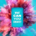
 REGISTRATION OPEN FOR ‘COLOURED BY INX’ CAN DESIGN CONTEST
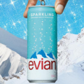 EVIAN LAUNCHES ITS FIRST SPARKLING WATER IN CANS
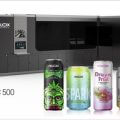 CROWN AND VELOX JOIN FORCES TO LAUNCH ULTRA-FAST DIGITAL BEVERAGE CAN DECORATOR
 TRIVIUM LAUNCHES METAL PACKAGING DESIGN COMPETITION
 RADNOR HILLS EXTENDS ITS RANGE OF MATT CANS WITH THE HELP OF ARDAGH METAL PACKAGING
 THE COLLABORATORS DESIGNS THE BOLD CANS OF REEL FISH
 New innovative resealable closure for beverage cans
 Exhibition “the cans of your life” travels to Madrid
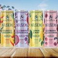
 Beverage can design trends that deliver unique experiences