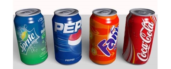
It is estimated that the average time a shopper spends in a supermarket looking at a product on the shelf is on average between one twenty-fifth and one fiftieth of a second, this time corresponds to a spontaneous visual shock that stamps an impression on the retina with the speed of light almost without realizing it.
In addition to the fact that impulse buying speed rises to 33%, it is true that this high percentage varies immensely according to product categories; it is also greatly influenced by advertising campaigns and promotions within consumers, impact and legibility are anyway extremely important particularly in packaging, even more so if one considers that about half of consumers do not have perfect vision.
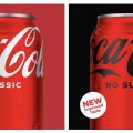
That is why it is really necessary for a brand to be noticed and to raise its interest in order to capture the consumer’s attention in the face of so many existing offers. The red color on the labels of Coca-Cola bottles and cans is unmistakable. We have always seen it, but why this color was chosen and not another.
Coca-Cola appeared in Atlanta, Georgia, on May 8, 1886. A local pharmacist by the name of Dr. John Stith Pemberton produced the syrup and took it to Jacobs’ Pharmacy for tasting. It was then taken to a soda fountain and combined with carbonated water.
Frank M. Robinson, Dr. Pemberton’s partner, said the ‘two C’s’ would look good in advertising and suggested the brand name and wrote ‘Coca-Cola’ in the handwriting we now know. One version suggests that in the mid-1990s, the barrels were painted red so that tax agents could differentiate them from alcohol when the product was being transported. The company’s official version indicates that at the time of designing the logo, the Spencerian typeface in contrasting red and white was chosen, at Robinson’s suggestion. In the end, red letters were left on a white background, and that’s how this color came to Coca-Cola.
The creation of this color is attributed to J. B. Chandler, who was the man who built the world’s largest Coca-Cola box in 1950. It is said that Chandler mixed three different shades of crimson, which resulted in the shade we identify today with the soft drink. However, there is no official pantone and the color mix is kept secret.
Another interesting case to analyze is that of PEPSI. Its color is blue and is related to water and, in addition, since it is a cold color, it is used to indicate that a drink is cold. In addition, from the point of view of marketing psychology, it creates in consumers a sense of security and trust in the brand.
In 1903, Caleb Bradham, a drugstore owner, patented Pepsi Cola. The logo was the word written in red on a white background. In the 1940s, Pepsi’s CEO decided to add the color blue to the mix to differentiate itself from the competition, Coca-Cola, and to show its support for the United States during World War II.
It should be remembered that the impact of a color is not necessarily synonymous with visibility. Experts have shown that the attention value of a color is not exclusively due to its nature and brightness, but also to the psychological effect it automatically produces.
In any case, the most visible colors are yellow, orange, red and green, which confirm the presence of the sympathy factor, as well as the visibility factor.

