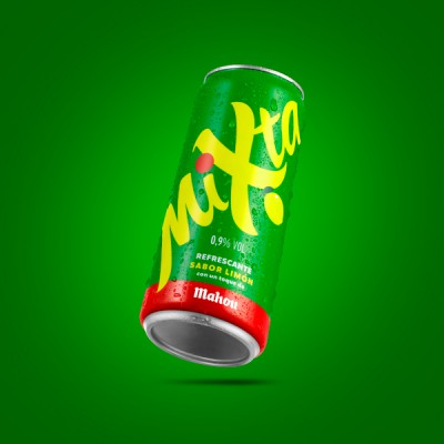
The Mixta brand, known for its lemon flavor with a touch of Mahou beer, has updated its visual identity and packaging design with a view to repositioning itself in 2025. The creative agency Supperstudio has been entrusted with the task of modernizing the image without losing the elements that have characterized it since its launch in 2005.
The redesign is based on an analysis of the drink’s main attributes: its refreshing profile, the connection with the Mahou brewery, its low alcohol content (0.9%), and its unique flavor. These elements have been key in the agency’s proposal, which has developed a renewed packaging architecture based on a new visual identity system.
Among the most notable changes are a more forceful lettering, the incorporation of a red dot as a distinctive element, and a more luminous and refined color palette. All of this has been conceived to reinforce the brand’s presence at the point of sale, while maintaining its original graphic essence, one of the requirements of the project.
One of the most strategic decisions has been to tilt the logo in the design to maximize its size and create a visual effect that envelops the packaging, generating greater notoriety. This solution has been applied to the entire range of formats, which includes 20, 25, and 33 cl bottles, 33 cl cans, and multipacks.


