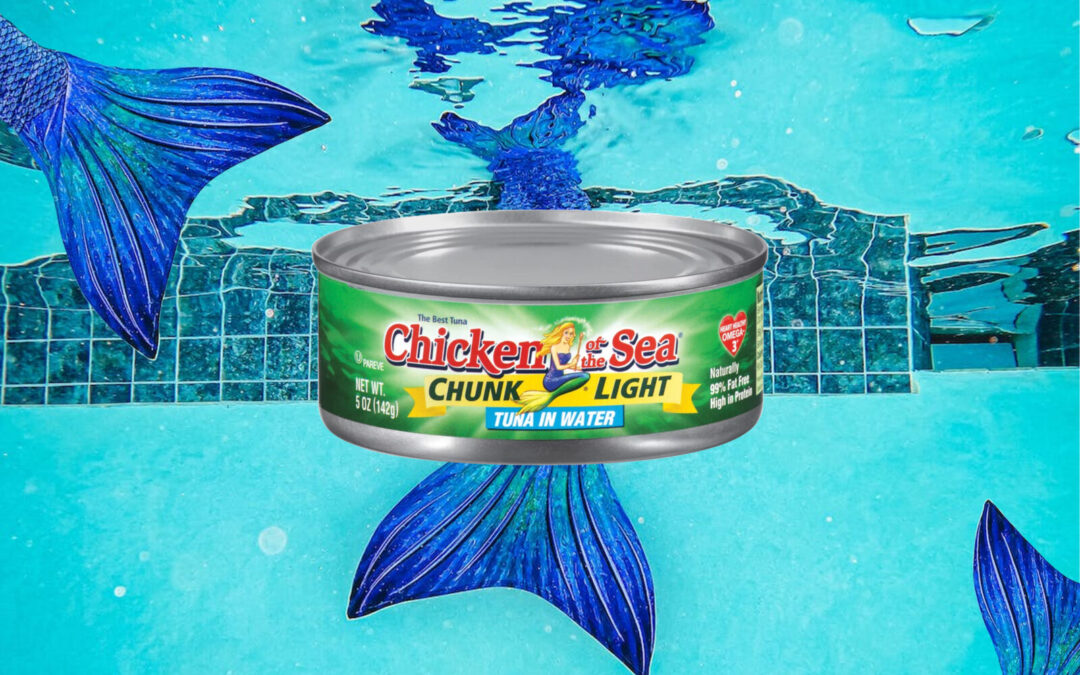
The seafood company, a leader for 20 years, made a significant change in its brand and content. The new identity will promote the importance of using wild products and update the image of its iconic spokesperson, the mermaid Catalina.
The new Chicken of the Sea design underwent significant changes: an updated logo, the addition of the iconic brand mascot -Catalina-, and an artistic representation of the nature surrounding the product. All this without forgetting the company’s emblematic colors.
To reflect its commitment to sustainability and modernize, Chicken of the Sea partnered with Little Big Brands to redesign the packaging, which has taken nearly two years to complete.
Bill Frohlich, senior director at Little Big Brands, noted that “the shelf-stable seafood category as a whole has experienced steady declines over the past 20 years as younger consumers have gravitated to the perimeter of the grocery store. But the sudden onset of the pandemic and some challenging economic conditions provided a resurgence for this pantry staple, with Chicken of the Sea seeing an increase in sales in 2020 as consumers sought affordable, accessible and healthy proteins for their families. With many exciting innovations on the way, the timing was right for a rebrand.”
 CONSTELLATION BRANDS INVESTS IN AN ORGANIC CANNED WINE BRAND FOUNDED BY WOMEN
 KING OSCAR BECOMES TOP SELLING CANNED SEAFOOD BRAND IN THE UNITED STATES
 THE BRITISH RE: WATER, THE FIRST WATER BRAND ON THE MARKET TO USE FULLY RECYCLED ALUMINUM BOTTLES
 BRUCE WILLIS RENEWS CONTRACT WITH HUNGARIAN HELL BRAND
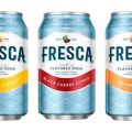 CONSTELLATION BRANDS REACHES AGREEMENT WITH COCA-COLA TO INCORPORATE THE FRESH BRAND IN ALCOHOLIC BEVERAGES