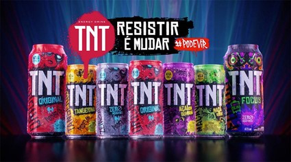
TNT Energy Drink wants to welcome the new year with new packaging, proving that changing the packaging is always a good thing. The Petrópolis Group’s energy drink has just adopted a new visual identity, with much more attractive and daring packaging, colorful and focused on the concept of street art, highlighting graffiti, which is already part of the brand’s new positioning.
The new launch is accompanied by a campaign broadcast on television, with the presence of DJ Alok and gamer Nobru, partners of the brand. “We have to celebrate the changes. We went after new views on resistance, bringing to our consumer a product with attitude, young and urban. We are very happy with the result,” says Eliana Cassandre, Marketing Manager of Petrópolis Group.
The restyled packaging was designed together with the agency Narita Strategy & Design, based on internal research with consumers and brand objectives. “Today, packaging goes far beyond energy cans, it’s becoming a decorative collection. With this in mind, and knowing that our territories are closely linked to TNT’s DNA, we understand that consumers value the visual identity that highlights the colors and the artistic concept,” adds Eliana.
TNT Energy Drink also wins the Focus version, in addition to taurine and caffeine, is the first energy rich choline in its formula and zero sugars. The product comes in unique packaging that also glows when exposed to black light.


